【WordPress】ヘッダーに追従型ボタンを設置する方法!!


ヘッダーにボタンを追加したい!
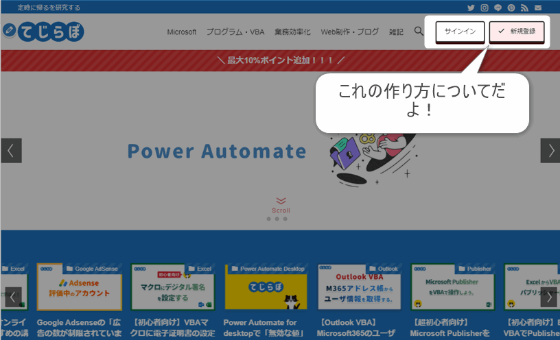
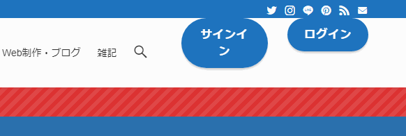
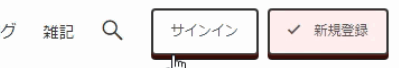
▲WordPressでヘッダーにボタンを2つ追加してみましたので追加方法について紹介します。
ヘッダーにボタンを追加するメリットは?
追従ヘッダーと組み合わせることで、ユーザーの画面スクロール操作についてくるボタンを作ることができます。これによってユーザーは、どのページにいてもボタンのページに飛ぶことができます。サイト運営者のメリットとしては、クリック率アップやコンバージョン率アップが狙えるかと思います。
ヘッダーにボタンを追加する手順の概要
 新人ブロガー
基本的な作業手順は、ブログパーツ作ってそれをヘッダーウィジェットから呼び出すだけです。
 先輩ブロガー
簡単だね!!
ヘッダーにボタンを追加する方法!
- ブログパーツでボタンを作成します。
- ヘッダーのウィジェットにブログパーツを追加します。
- ヘッダーの追従設定をします。
- (オプション)ボタンをキラッと光るボタンにする方法。
- (オプション)マウスオーバーのエフェクトを追加する方法。
1.ブログパーツでボタンを作成する。
新人ブロガーまずは「ブログパーツ」としてボタンを作っていきます。
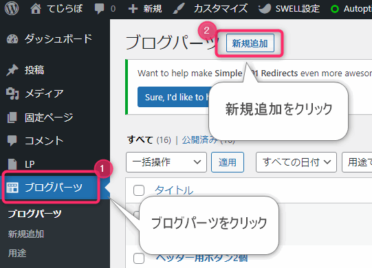
WordPressの管理画面にログインし、①ブログパーツをクリックし②新規追加をクリックします。
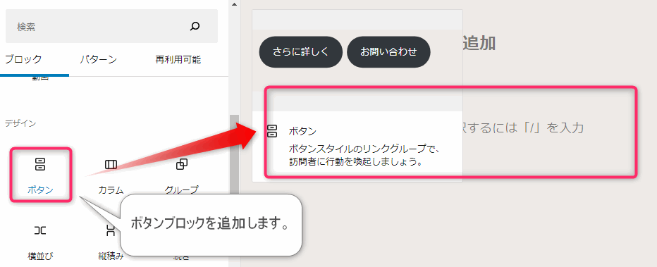
SWELLをお使いの場合、ボタンブロックには下記の2種類あります。一番大きな違いは下記です。アフィリエイトリンクを直接ボタンにしたい場合はSWELLボタンが良いかと思います。ここではWordPress標準ボタンを使って解説します。
2つのボタンブロックの違い
- ボタン(WordPress標準)
- アフィリエイトのテキスト広告タグを使えない。
- SWELLボタン
- アフィリエイトのテキスト広告タグを使える。
- クリック率の計測ができる。
- 光るボタンがかんたんに作れる。
- マウスオーバー時のエフェクトがある。
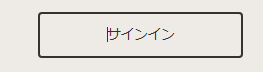
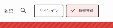
▲ボタンにテキストを入力します。わたしは「サインイン」と入力しました。
テキストを入力したらスタイルをお好みに合わせて設定しましょう。わたしは下記の設定を行いました。
ボタンの設定値の例
- スタイル:輪郭
- 幅の設定:オフ
- サイズ:0.75em
- 色:白
- 文字:黒
- 角丸:4px
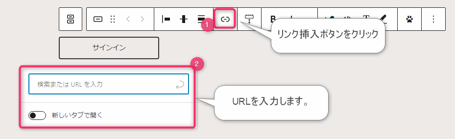
▲ボタンを選択して表示されるメニューの中の①リンク挿入ボタンをクリックします。②表示されたボックスに、ボタンをクリックしたときのリンク先URLを入力します。
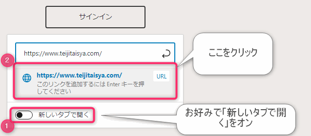
▲①お好みに合わせて「新しいタブで開く」オプションをオンにします。②「このリンクを追加するには・・・」をクリックします。(エンターキーでもOK)
「新しいタブで開く」オプションについて
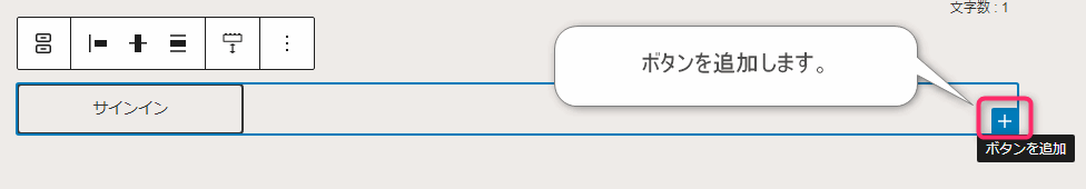
ボタンを複数追加する場合は、ボタンブロックの右下の「ボタンを追加」ボタンをクリックしてもう一個ボタンを作りましょう。
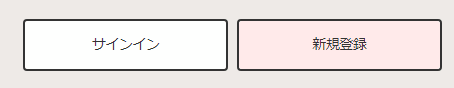
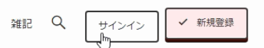
▲わたしはこんな感じにしました。
ボタンデザインのアイデア!
複数のボタンを設置する際は、色・形・アイコンを使って情報の優先度をつけるようにする良いですよ!今回の例では「新規ユーザー獲得」をこのサイトでのゴールと想定しているので「新規登録」ボタンの方を目立つ色にしています。
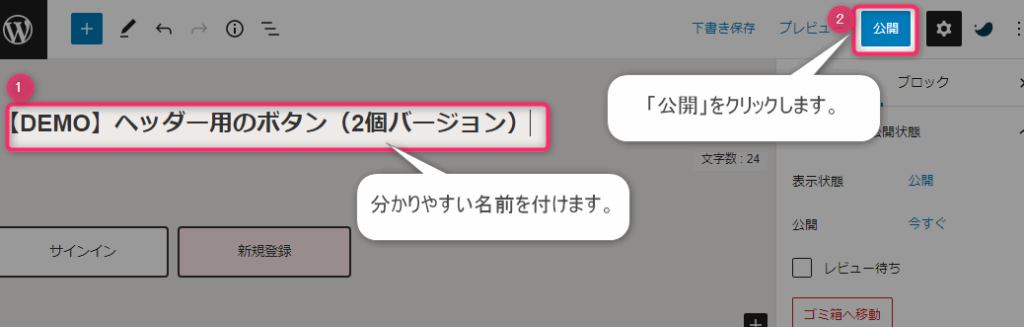
▲①ブログパーツに分り易い名前を付けます。②右上の公開ボタンをクリックします。
以上で、ボタンのブログパーツの完成です。
ボタンにアイコンを使う方法
ボタンにアイコンを使うことでボタンのリンク先ページのイメージをしやすくなり、クリック率が上がるかもしれません。
ボタンのアイコンの設定方法は、ボタンの種類によって異なります。
ボタン内アイコンの追加方法
- SWELLボタン
- グーテンベルグエディタの右側にあるアイコンの設定から行います。
- WordPress標準ボタン
- ボタン内テキストにショートコードを埋め込みます。
ショートコードを使ってボタンにアイコンを追加する方法
SWELLで使用可能なアイコンの一覧はSWELL公式サイトをご覧ください。使用するにはアイコンのクラス名を使って下記のように記述します。
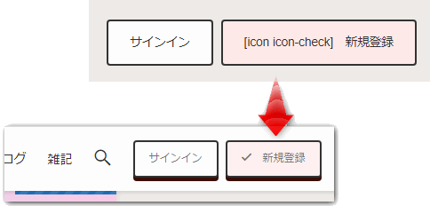
▲ボタンで使用する際は、ボタンのラベルテキストと一緒に記述します。上図は使用例です。
2.ブログパーツを呼び出します
新人ブロガー続いてブログパーツを呼び出す設定です!

作成したブログパーツは呼び出しコードを使って記事やウィジェットから呼び出すことができます。先ほど作成したブログパーツの呼び出しコードを確認しコピーしておきましょう。
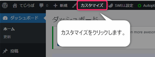
▲WordPressのダッシュボードから「カスタマイズ」をクリックします。
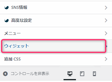
▲「ウィジェット」をクリックします。
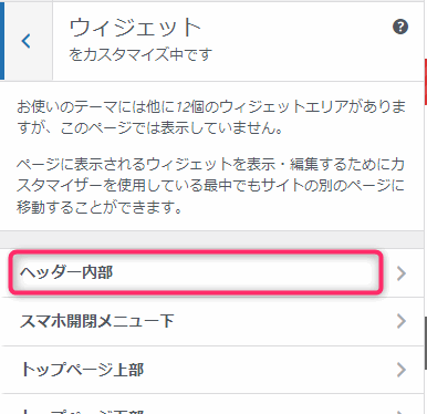
▲「ヘッダー内部」をクリックします。
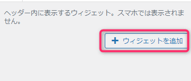
▲「ウィジェットを追加」します。
※すでに追加済みのウィジェットがある場合はレイアウト崩れにご注意ください。
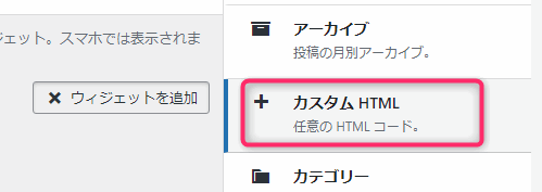
▲「カスタムHTML」を追加します。
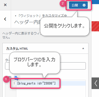
▲カスタムHTMLの「内容」に、先ほどコピーしたブログパーツの呼び出しコードをペーストします。②「公開」ボタンをクリックします。
▲完成図です。以上でボタンをヘッダーに設置することができました。
3.ヘッダーの追従設定をします。
新人ブロガーヘッダーの追従設定をオンにすることで、ユーザーのスクロール操作についてくるボタンが作成できます。
ヘッダーの追従設定方法
WordPress管理画面上部のカスタマイズをクリック > ヘッダーをクリック
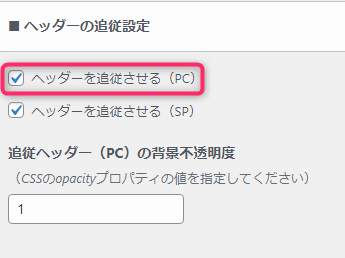
▲「ヘッダーを追従させる(PC)」の設定をオンします。
以上でヘッダーの追従設定は完了です。
CSSでボタンをカスタマイズしよう!
新人ブロガーWordPressの標準ボタンは装飾やアニメーションがシンプルなので、CVボタンとしてそのまま使うにはイマイチです。
先輩ブロガーCSSを使ってカスタマイズしていきましょう!
CSSによるボタンカスタマイズの例
- マウスホバー時のアクションを追加
- キラッと光らせるアニメーションを追加
CSSカスタマイズの方法
新人ブロガーCSSを追加は「追加CSS」から行うのが安全です!
WordPress管理画面上部のカスタマイズをクリック > 「追加CSS」をクリック
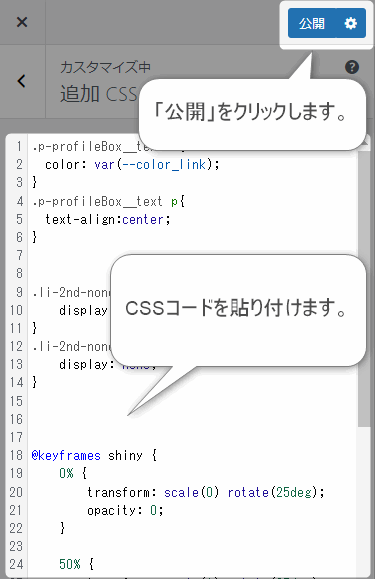
▲「追加CSS」とは、WordPressテーマで用意されたCSSとは別に、ユーザーが独自に追加できるCSSです。ここにCSSを貼り付けることで細かいデザインのカスタムができます。
CSSの例は次の項で紹介します。
【CSS】マウスオーバー時にボタンが動く
マウスオーバーとは、「ボタンにマウスカーソルが重なった時、あるいは重ねる行為」のことです。マウスホバーとも呼ばれます。
私は通常時を立体型ボタンにし、マウスオーバー時にボタンが押し込まれたように見えるようにしました。
/* マウスカーソルがのってない時のボタン */
.l-header__inner .wp-block-button__link,
.l-fixHeader__inner .wp-block-button__link{
    transition: background 1s; /* アニメーションの頻度(秒) */
	box-shadow: 0 4px 0 #3a0d08; /* ボタンの影の高さと色 */
}
/* マウスカーソルがのっている時のボタン */
.l-header__inner .wp-block-button__link:hover,
.l-fixHeader__inner .wp-block-button__link:hover
{
	  transform: translateY(4px); /* Y方向へボタンを移動 */
	  box-shadow: none; /* ボタンの影を非表示 */
}
【CSS】キラッと光るアニメーションを追加する
ボタンをキラキラ光らせることでユーザーの視線を引き付けて、クリック率を上げることができます。
コードは下記のサイト様から頂戴しました。元のコードのクラス名をWordPress用に変更し、line-heightを削除させていただいております。ありがとうございます。
参考サイト
【CSS】キラッと光るボタンの作り方!目立つボタンでクリック率を向上させよう | Into the Program
@keyframes shiny {
    0% {
        transform: scale(0) rotate(25deg);
        opacity: 0;
    }
    50% {
        transform: scale(1) rotate(25deg);
        opacity: 1;
    }
    100% {
        transform: scale(50) rotate(25deg);
        opacity: 0;
    }
}
.l-header__inner .wp-block-button__link,
.l-fixHeader__inner .wp-block-button__link{
    position: relative;
    display: block;
    width: 100%;
    text-align: center;
    text-decoration: none;
    color: #ffffff;
    background-color: #384878;
    overflow: hidden;
}
.l-header__inner .wp-block-button__link::after,
.l-fixHeader__inner .wp-block-button__link::after{
    content: '';
    position: absolute;
    top: -100px;
    left: -100px;
    width: 50px;
    height: 50px;
    background-image: linear-gradient(100deg,  rgba(255, 255, 255, 0) 10%, rgba(255, 255, 255, 1) 100%, rgba(255, 255, 255, 0) 0%);

    /* アニメーション */
    animation-name: shiny;
    animation-duration: 3s;
    animation-timing-function: ease-in-out;
    animation-iteration-count: infinite;
}
子テーマを使おう!
上記の「追加CSS」設定はWordPressテーマのバージョンアップを行うと、リフレッシュされて消えてしまいます。
対策として、子テーマを使い、子テーマの「追加CSS」を設定することで設定値のリフレッシュを防ぐことができます。なるべく子テーマを使うようにしましょう!多くのテーマは子テーマが無料提供されているはずです。
SWELLも子テーマは無料で提供されています!
まとめ
 じょじお
じょじおヘッダーにボタンを追加する方法について紹介しました!
先輩ブロガー最後までご覧くださってありがとうございました!

【おすすめUdemy講座】Midjourney始め方から応用まで網羅!【完全版】
【おすすめUdemy講座】ジェネレーティブAI(生成AI)入門【ChatGPT/Midjourney】 -プロンプトエンジニアリングが開く未来-